Powerapps Canvas Guidelines
Lately I’ve find out the PowerApps canvas app coding standards and guidelines white paper. Such White Paper has been drafted so that adherence to these guidelines will help developers in these areas:
- Simplicity
- Readability
- Supportability
- Ease of deployment and administration
- Performance
- Accessibility
Note
the original PDF document can be downloaded from here, below there is the Markdown version translated using the pdf-tools project
PowerApps canvas app coding
standards and guidelines
White paper
Summary: This technical white paper is aimed at Microsoft PowerApps makers in the enterprise. It contains standards for naming objects, collections, and variables, and guidelines for developing consistent, performant, and easily maintainable apps.
Writers: Todd Baginski, Pat Dunn
Technical Contributors: Mehdi Slaoui Andaloussi, Alex Belikov, Casey Burke, Ian Davis, Brian Dang, Rémi Delarboulas, Aniket J. Gaud, Nick Gill, Audrie Gordon, Erik Orum Hansen, Eric Mckinney, Santhosh Sudhakaran, Hubert Sui, Vanessa Welgemoed, Keith Whatling
Contents
- Introduction
- Purpose of this white paper
- Scope of this white paper
- This is a living doc
- General naming conventions
- Camel case
- Pascal case
- Object naming conventions
- Screen names
- Control names
- Data source names
- Code naming conventions
- Variable name
- Collection names
- Organizing your objects and code
- Using groups for organization
- Format text feature
- Minimizing the number of controls that you create
- Finding the best place for your code
- Other tips for organization
- General coding guidelines
- Click targets
- Variables and collections
- Nesting
- Optimizing for performance
- OnStart code
- Concurrent function
- Delegable calls vs. non-delegable calls
- Using local collections
- SQL optimization
- Expensive calls
- Limiting the package size
- Periodically republishing your apps
- Advanced settings
- App design
- Using parent/child relationships for relative styling
- Galleries
- Forms
- Common Data Service for Apps
- Multiple form factors
- Configuration values
- Creating a hidden configuration screen
- Storing configuration values in Common Data Service for Apps
- Using a custom API
- Error handling/debugging
- Toggle controls for error handling
- Using a canvas control as a debug panel
- Showing debug controls to app makers
- Documentation
- Code comments
- Documentation screens
Introduction
Microsoft PowerApps is a high-productivity application development platform from Microsoft. Microsoft uses this platform to build first-party applications in Microsoft Dynamics 365 for Sales, Microsoft Dynamics 365 for Service, Microsoft Dynamics 365 for Field Service, Microsoft Dynamics 365 for Marketing, and Microsoft Dynamics 365 for Talent. Enterprise customers can also use the same platform to build their own custom line-of-business applications. Individual users and teams within your organization can also build personal or team productivity applications without having to write very much code (or any).
Purpose of this white paper
This white paper is targeted at the enterprise application maker (developer) who is responsible for designing, building, testing, deploying, and maintaining PowerApps apps in a corporate or government environment. This white paper was developed as a collaboration between the Microsoft PowerApps team, Microsoft IT, and industry professionals. Of course, enterprise customers are free to develop their own standards and practices. However, we feel that adherence to these guidelines will help developers in these areas:
- Simplicity
- Readability
- Supportability
- Ease of deployment and administration
- Performance
- Accessibility
Scope of this white paper
Except where specifically noted, all features that are mentioned in this white paper are available as of December 2018. The following topics are out of scope for this white paper:
- PowerApps fundamentals for building applications. This white paper assumes that the reader has a working knowledge, but not necessarily expert knowledge, of how to build a PowerApps app. For blogs, tutorials, training resources, and community support, visit https://docs.microsoft.com/en-us/powerapps/index.
- Microsoft Power BI and other parts of the broader Microsoft Power platform.
- Code outside PowerApps, such as code in Microsoft Azure App Service and Function App.
- General governance and Application Lifecycle Management (ALM).
- Environment administration. To learn about this topic, we recommend that you read the Administering a PowerApps enterprise deployment white paper.
This is a living document
This white paper is intended to be a living document. As Microsoft Power platform capabilities and industry standards change, so will this white paper. Microsoft is listening to customer feedback and is constantly evolving the Power platform to help you build better apps for your users. As a result, today’s best practice might become obsolete as new features change the most efficient approaches. Check back periodically to see the latest standards and guidelines.
Thank you to all the professionals who have contributed to this white paper by sharing your collective guidance and experience. Now, on to the guidance.
General naming conventions
This section describes “camel case” and “Pascal case” naming conventions. If you’re already familiar with those terms, you can skip ahead.
Camel case
You should use camel case for controls and variables. Camel case begins with a lowercase prefix,
removes all spaces from object or variable names, and capitalizes the first letter of each word after the
first. For example, a text input control might be named txtUserEmailAddress.
Pascal case
You should use Pascal case for data sources. Pascal case is sometimes referred to as “upper camel case.”
Like camel case, it removes all spaces and capitalizes the first letter of words. However, unlike camel
case, Pascal case also capitalizes the first word. For example, a common data source in PowerApps is the
Microsoft Office 365 Users connector, which is named Office365Users in your code.
Object naming conventions
As you create objects in your PowerApps apps, it’s important to use consistent naming conventions for screens, controls, and data sources. This approach will make your apps easier to maintain, can help improve accessibility, and will make your code easier to read as those objects are referenced.
Note: As we were preparing this white paper, we found lots of variance in the naming conventions of different organizations. One experienced maker renames her controls only if they’re referenced in formulas. Several makers prefer different prefixes for their controls. This is OK! The object naming conventions in this white paper are intended as guidelines, and organizations are free to develop their own standards. The main point is to be consistent.
Screen names
Screen names should reflect the purpose of the screen, so that it’s easier to navigate through complex apps in PowerApps Studio. What’s less obvious is that screen names are read aloud by screen readers, which are needed for users who have vision accessibility needs. Therefore, it’s imperative that you use plain language to name your screens, and that the names include spaces and no abbreviations. Also, we recommend that you end the name with the word “Screen,” so that the context is understood when the name is announced.
Here are some good examples:
Home ScreenThrive Help Screen
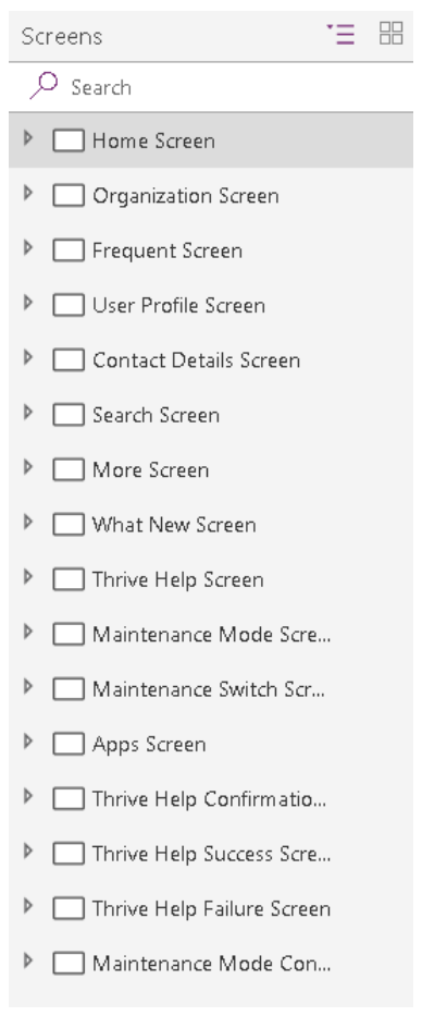
Here are some bad examples:
HomeLoaderScreenEmpProfDetailsThrive Help
Control names
All control names on the canvas should use camel case. They should begin with a three-character type
descriptor, followed by the purpose of the control. This approach helps identify the type of control and
makes it easier to build formulas and search.
Here’s a good example: lblUserName
The following table shows the abbreviations for common controls.
| Control name | Abbreviation |
|---|---|
| button | btn |
| camera control | cam |
| canvas | can |
| card | crd |
| collection | col |
| combo box | cmb |
| dates | dte |
| drop down | drp |
| form | frm |
| gallery | gal |
| group | grp |
| header page shape | hdr |
| html text | htm |
| icon | ico |
| image | img |
| label | lbl |
| page section shape | sec |
| shapes (rectangle, circle, and so on) | shp |
| table data | tbl |
| text input | txt |
| timer | tim |
Control names must be unique across an application. If a control is reused on multiple screens, the short
screen name should be suffixed at the end – for example, galBottomNavMenuHS, where “HS” stands
for “Home Screen.” This approach makes it easier to reference the control in formulas across screens.
Here are some bad examples:
zipcodeNext
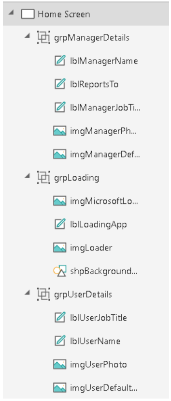
As the following image shows, if you consistently name your controls, your app will be much cleaner in the navigation view, and your code will be much cleaner too.
Data source names
When you add a data source to your application, the name can’t be changed in the PowerApps app. The name is inherited from the source connector or data entities that are derived from the connection. Here are some examples:
- Name inherited from the source connector: The Office 365 Users connector is named
Office365Usersin your code. - Data entities derived from the connection: A Microsoft SharePoint list that’s named Employees
is returned from the SharePoint connector. Therefore, the name of the data source in your code
is
Employees. The same PowerApps app can also use the same SharePoint connector to access a SharePoint list that’s named Contractors. In this case, the name of the data source in the code isContractors.
For more information about connectors and connections, see the Overview of canvas-app connectors for PowerApps article.
Standard action connectors
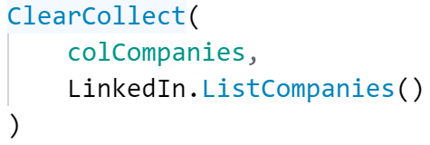
In Standard action connectors that expose functions, such as LinkedIn, you’ll see that the data source
name and its operations use Pascal casing (that is, UpperUpperUpper). For example, the LinkedIn data
source is named LinkedIn and has an operation named ListCompanies.
Custom connectors
Custom connectors can be created by any maker in your environment. They’re used to connect to custom application programming interfaces (APIs) such as third-party services or line-of-business APIs that your IT department has created. Pascal casing is also recommended for the data source name and its operations. Just be aware that the custom connector name and the way that it appears in PowerApps can differ. For example, here’s a custom connector named MS Auction Item Bid API.

But when you create a connection from this connector and add it to your PowerApps app as a data source, it appears as AuctionItemBidAPI.
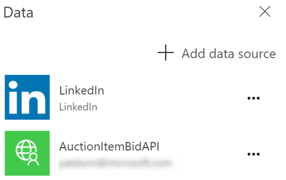
To discover the reason, you can look inside the OpenAPI file. There, you’ll see a title attribute that
contains the text Auction Item Bid API.

PowerApps removes all the spaces from this attribute value and uses it as the name of your data source.
We recommend that you change the value of this attribute to a Pascal-cased name such as
AuctionItemBidAPI and use it as the name of your custom connection. In that way, there will be no
confusion. Change this value before you import the OpenAPI file to create the custom connector.
Note: If you use the Create from blank option instead of importing an existing OpenAPI file, PowerApps
will prompt you for the custom connector name. This name will be used both as the name of the custom
connector and as the value of the title attribute inside the OpenAPI file. Once again, if you just use a
Pascal-cased name such as AuctionItemBidAPI, you’ll be fine.
Excel DataTables
PowerApps uses DataTables in Microsoft Excel to connect to data in Excel worksheets. Keep these points in mind when you create Excel documents as data sources: • Give your DataTables descriptive names. You’ll see the name in the PowerApps app when you write the code to connect to it.
- Use one DataTable per worksheet.
- Give the same name to the DataTable and worksheet.
- Use descriptive column names in the DataTables.
- Use Pascal casing. Each word of the DataTable name should begin with a capital letter (for
example,
EmployeeLeaveRequests).
Code naming conventions
As you add code to your PowerApps apps, it becomes increasingly important to use consistent naming
conventions for variables and collections. If variables are named correctly, you should be able to quickly
discern the type, purpose, and scope of each.
We found lots of variance in the code naming and object naming conventions of different organizations.
For example, one team uses data type prefixes for its variables (such as strUserName to indicate a
string), whereas another team prefixes all its variables with an underscore (_) to group them in
IntelliSense. There are also differences in the way that teams denote global variables versus context
variables.
The same guidance applies here: Have a pattern for your team, and be consistent in its usage.
Variable names
- Be descriptive of the variable’s function. Think about what the variable is bound to and how it’s used, and then name it accordingly.
- Prefix your global and context variables differently. Be smart! PowerApps lets context variables and global variables share the same names. This can cause confusion, because, by default, your formulas use context variables unless the disambiguation operator is used. Avoid this situation by following these conventions:
- Prefix context variables with
loc. - Prefix global variables with
gbl. - The name after the prefix should indicate the intent/purpose of the variable. Multiple words can be used and don’t have to be separated by any special characters (for example, spaces or underscores), provided that the first letter of each word is capitalized.
- Use Camel casing. Begin your variable names with a prefix in lowercase letters, and then
capitalize the first letter of each word in the name (that is,
lowerUppperUpper). Here are some good examples: - Global variable:
gblFocusedBorderColor - Context variable:
locSuccessMessage
Here are some bad examples:
dSubrstFldshideNxtBtnttlOppCtcFVcQId
Avoid short and cryptic variable names such as EID. Use EmployeeId instead.
Note: When there are many variables in an app, you can just type the prefix in the formula bar to see a list of the available variables. If you follow these guidelines to name your variables, you’ll be able to find them very easily tin the formula bar as you develop your app. Ultimately, this approach leads to quicker app development.
Collection names
- Be descriptive of the collection’s contents. Think about what the collection contains and/or how it’s used, and then name it accordingly.
- Collections should be prefixed with
col. - The name after the prefix should indicate the intent or purpose of the collection. Multiple words can be used and don’t have to be separated by spaces or underscores, provided that the first letter of each word is capitalized.
- Use Camel casing. Begin your collection names with a lowercase
colprefix, and then capitalize the first letter of each word in the name (that is,colUpperUpper).
Here are some good examples:
colMenuItemscolThriveAppsHere are some bad examples:orderscolltempCollection
Note: When there are many collections in the app, you can just type the prefix in the formula bar to see a list the available collections. As for variables, if you follow these guidelines to name your collections, you’ll be able to find them very easily in the formula bar as you develop your app. Ultimately, this approach leads to quicker app development.
Organizing your objects and code
Using groups for organization
All controls on a screen should belong to a group, so that you can easily recognize their purpose, move them around a screen or between screens, or collapse them to simplify your view. Gallery, Form, and Canvas controls are already groups, but they can also, optionally, be part of another group to help improve organization.
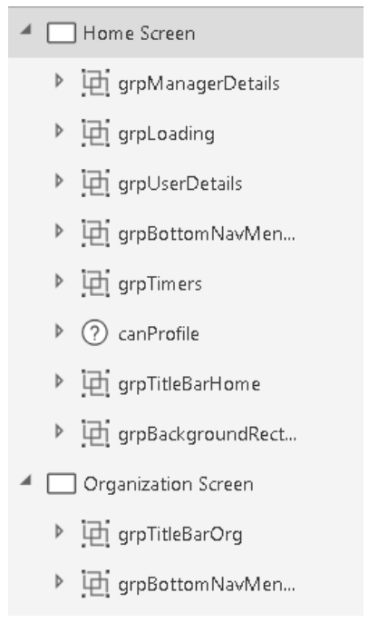
Optionally, you can use the experimental enhanced Group control, which allows for nesting of groups, group-level settings, keyboard navigation, and more.
Format text feature
As the complexity of a formula increases, readability and maintainability are affected. It can be very difficult to read a large block of code that contains multiline functions. The Format text feature adds line breaks and indentation to make your formula easier to read. As for code comments, the extra white space is removed from the app package that’s downloaded to the client. Therefore, there’s no need to use the Remove formatting feature before you publish your app.

Minimizing the number of controls that you create
To minimize complexity, try to limit the number of controls in your apps. For example, instead of having
four image controls that lie on top of each other and have different Visible property settings, use one
image that includes logic in its Image property to show different images.

Finding the best place for your code
As the complexity of your PowerApps apps increase, it can become more difficult to find your code
when it’s time to debug an application. A consistent pattern makes this challenge easier. Although this
section isn’t exhaustive, it provides some guidelines about the best place for your code.
As general guidance, try to move your code to the “top level” as much as possible, so that it’s easier to
find in the future. Some makers like to put code in the OnStart property. This approach is fine,
provided that you understand the OnStart property’s limitations, and possible perceived implications
for app performance. Other makers prefer to put code in the OnVisible property, because it’s easy to
find, and code reliably runs whenever the screen is visible.
Code encapsulation
Whenever possible, try not to distribute your code across screens, so that all the code resides on one
screen. For example, one maker built a people browser app that shows the organizational hierarchy in a
gallery. When a user clicks a name, the app goes to a new screen and shows the employee profile. In this
case, the maker didn’t put the logic to load the profile in the gallery’s OnSelect property. Instead, the
app just passes any variables that are needed on the next screen as context variables in the Navigate
function. The User Profile screen does all the work to load the user profile.
Here’s the Navigate function in the gallery’s OnSelect property for this example.
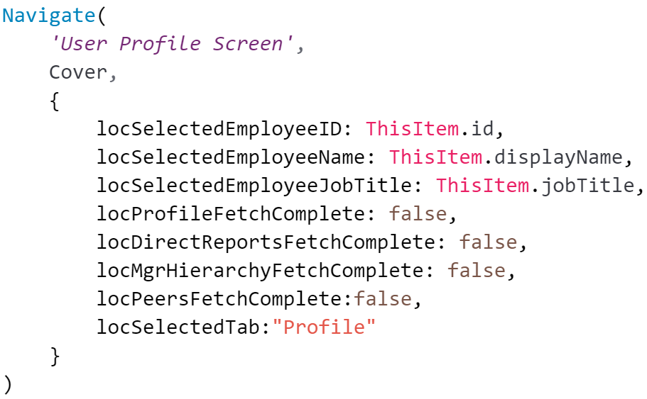
Then, in the OnVisible property of the User Profile screen, call Office365Users.UserProfileV2
by using the user ID that was received from the previous screen. Subsequent code then uses the other
context variables that were passed.

Note: The previous example passes ThisItem values as context variables instead of having the next
screen refer to the Selected property of the previous screen. This approach was used deliberately,
because this app has multiple paths to the User Profile screen from other screens that include galleries.
The screen is now encapsulated and can easily be reused in this app and other apps.
OnStart property
In general, try to limit the code that you put in the OnStart property, because it’s difficult to debug. To
debug code there, you must save, close, and then reopen your PowerApps app in PowerApps Studio to
make the code run again. You can’t create context variables in this property. Think of it as
Application.OnStart, which runs only once before any screen is shown.
Here are the recommended uses for OnStart:
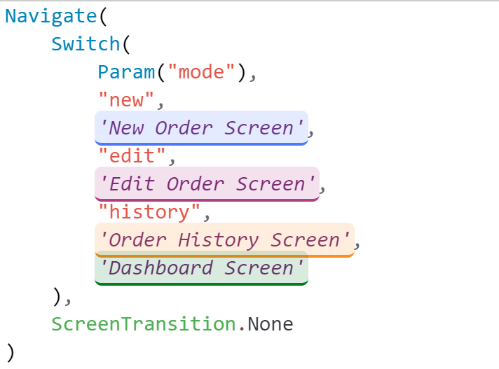
- Screen routing: Unlike the
OnVisibleproperty, you can use theNavigatefunction in theOnStartproperty. Therefore, it can be a handy place to make routing decisions. For example, you can evaluate a parameter namedmodenullto determine which screen to show.
- Impersonation or debug privileges: You can create code in the
OnStartproperty to check whether the current user is on a list of email addresses and, if the user is on the list, turn on a debug mode that shows hidden screens and text input controls.
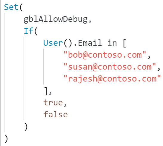
Note: You can also check Azure Active Directory (AAD) group membership to apply security settings to your apps.
- Static global variables: Use the
OnStartproperty to create collections of error messages or set global style variables, such as control colors and border widths. For another approach, see the Creating a hidden configuration screen section later in this white paper. - “Run once” code: By its definition, code that’s put in the
OnStartproperty runs only once, while the app is starting but before the first screen is visible. On the other hand, code in theOnVisibleproperty runs every time a user goes to that screen. Therefore, if you need your code to run only once, consider putting it in theOnStartproperty. - Code that runs quickly: For specific guidance about the
OnStartproperty, see the Optimizing for performance section later in this white paper. For more information about theOnStartandOnVisibleproperties, watch the PowerApps OnStart and OnVisible Development Tricks video by Todd Baginski.
OnVisible property
The OnVisible property is the place to put code that must run every time a user goes to a screen. Be
careful about putting code in this property. If possible, avoid putting logic in the OnVisible property
on the first screen of your PowerApps app. Instead, try to use inline expressions in control properties.
The OnVisible property is a great place to set global or context variables. However, be careful about
the calls that you make to set those variables. Quick calls, such as calls to Office365Users.Profile
or calls to set a static color for reuse in controls, are acceptable. However, stay away from complex logic
and code that takes a long time to run.
For more information about performance issues that are related to the OnVisible property, see the
Expensive calls section later in this white paper.
OnTimerStart property
Timers present interesting possibilities for event-based code execution. Typically, makers hide timer
controls and set the Start property to watch a Boolean variable or control state.
For example, if you want to have a form that lets the user switch an auto-save feature on and off, you
can create a toggle control that’s named tglAutoSave. A timer on the screen then has its Start
property set to tglAutoSave.Value, and code in the OnTimerStart property can save the data.
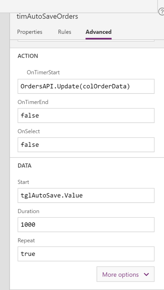
In the OnTimerStart property, you can also put code that uses the ClearCollect function to reload
data at a specified refresh interval.
The OnTimerStart property also supports the Navigate function. You can use it to go to another
screen when specific conditions are met. For example, a loader screen sets a Boolean context variable
when all data has been loaded, and the timer then goes to a data display screen. Alternatively, you can
use this property to go to a “Session timed out” message screen after a period of inactivity.
This pattern comes with two caveats:
-
The timer won’t fire when you’re editing the app in PowerApps Studio. Even if
AutoStartis set totrue, or an expression is evaluated as true in theStartproperty, theOnTimerStartproperty code won’t be triggered. However, it will be triggered when you switch to Preview Mode (F5). 16 -
Before the
Navigatefunction fires, there can be enough of a delay for additional code to run on the screen. For example, you have a timer control on a loader screen. You set the control’sStartproperty tolocRedirect, a Boolean context variable, and you put the following navigation code in theOnTimerStartproperty.
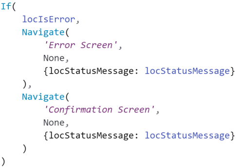
The OnVisible property of the loader screen retrieves the employee ID and sets
locRedirect to false if the ID isn’t numeric (because non-numeric employee IDs are error
conditions).
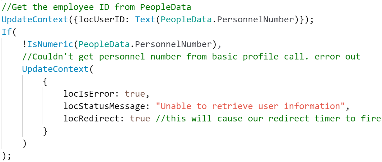
When locRedirect is set to true, the timer control’s OnStart code runs, but there’s a slight
delay, during which code in the OnVisible property continues to run. Therefore, do an
additional error check for the next few lines of code.

OnSelect property
Code in the OnSelect property of a control runs whenever that object is selected. Object selection can
occur through user interaction, such as the click of a button or selection of a text input control. The code
that runs here can validate form data and show validation messages or hint text, or it can read from and write to your data source.
Note: Avoid putting long-running code in the OnSelect property, because long-running code can give
the impression that the application has stopped responding. For more information, see the Optimizing
for performance and Expensive calls sections later in this white paper. Also consider loading indicators
or status messages to help prevent the perception of slowness.
Code that’s put in the OnSelect property will also run when the control is selected by using the
Select function. A useful pattern is to have a loader screen as the first screen of the application. A
label control can show a message such as “Loading app data.” The OnSelect property of this label
control can call your data sources and initialize variables, and then navigate to the home screen of the
application. The label control is then selected by calling the Select function in the application’s
OnStart property.
Although the initialization code can also reside in the OnStart or OnVisible property, there are
benefits to this approach:
OnVisiblecode doesn’t allow for navigation. Therefore, you must add navigation code to a control, such as a timer.OnStartcode will prolong the splash screen or, if the Use non-blocking OnStart rule preview feature is turned on, might have unexpected results.- When the label control is programmatically selected, users who have a vision impairment will hear the text of the label control read to them by their screen reader as data is loaded. This pattern provides a great experience when a screen reader is used, as the user hears “Loading screen,” “Loading app data,” or “Home screen.”
Caution: If you use the Select function in the OnVisible property to select a control, and that control
then uses a Navigate function to go to another screen, it might not be possible to edit the screen.
To avoid this situation, use a toggle control on a hidden settings screen in the app. Then check the state of
this toggle in the OnSelect property before you call the Navigate function.

Other tips for organization
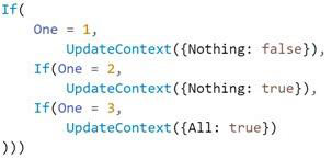
- Don’t “nest” secondary logical tests by explicitly writing
Ifafter the initial statement.
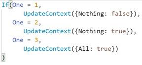
- To write secondary logical tests, just write the logical test, without explicitly writing
If.
- Avoid lengthy expressions whenever possible.
- To manually format your code, follow these guidelines:
- Each semicolon should represent a line break.

- For long single-line formulas, try to insert line breaks in reasonable places: before and after parentheses, commas, and colons.
- Each semicolon should represent a line break.
General coding guidelines
Click targets
If actions should be performed when a group of controls is clicked, there are three approaches that you can use:
- The simplest approach is to group the controls and then assign click events to the group’s
OnSelectproperty. - Put the code in one of the controls in the group (the most significant control), and then add
Select(controlWithLogicnull to theOnSelectproperty of all the other controls in the group. As for the first approach, no additional controls are required, and the controls can easily be selected in the editor. - Lay a transparent rectangle on top of the group, and use the rectangle’s
OnSelectproperty.
We recommend the third approach, because code isn’t affected as much if the controls in the group change. This approach also gives the maker more flexibility about the shape of the clickable region. Although the controls inside the rectangle are more difficult to select directly on the screen, you can select them individually in the Screens pane on the left side of the editor.
For more information about this approach, see the article HOW TO: Use Transparent Rectangles Effectively In a PowerApp article by Todd Baginski.
Variables and collections
Context variables
Limit your use of context variables. Try to use them only when they’re absolutely necessary. Know when to use context variables versus global variables. Use a global variable when you need it to be available on all screens. Use a context variable if you want to limit the scope of a variable to a single screen. Avoid passing context variables between screens when a global variable might be more appropriate (and much easier to debug).
Update all necessary context variables in a single UpdateContext call. In this way, you make your code more efficient and easier to read.
For example, use this call to update several context variables.

Don’t use these separate calls.

Global Variables
Don’t use multiple variables when you can use just one. Here’s an example of multiple variables.

Instead, you can use just one variable, as shown here.

Collections
Limit your use of collections. Try to use them only when they’re absolutely necessary.
Use ClearCollect instead of Clear;Collect.

To count the records in a local collection, use CountIf instead of Count(Filter()).
Nesting
Avoid using unnecessary DataCards and canvases, especially if they have nested galleries.
Avoid nesting in other operators too, such as the ForAll function.

Note: A previous version of this document stated that nested galleries would be deprecated. This is incorrect and we apologize for the error. 20
Optimizing for performance
OnStart code
The OnStart property is invaluable for those one-time calls that are needed to initialize your apps. It
might be tempting to put your data initialization calls in this property too. However, while OnStart
code is running, the user will continue to see the app splash screen and a “Getting your data” message,
and the perceived load times will be longer.
For a better user experience, we recommend that you let the home screen be shown with placeholders
for data, such as double dashes (–). Then fill in the data after it’s retrieved. In this way, the user can
begin to read content on the home screen or interact with controls that aren’t data-dependent. For
example, the user can open an About screen.
Concurrent function
PowerApps runs your data source calls from top to bottom in a module. If you have several calls, this
linear execution can negatively affect app performance. One workaround for this issue has been to use
timer controls to concurrently fire data calls. However, this approach is difficult to maintain and debug,
especially when some timers depend on other timers.
The Concurrent function eliminates the need to use timer controls to make multiple data calls at the
same time. The following code snippet replaces several API calls that used to reside in the
OnTimerStart property of timer controls in the app. This approach is much easier to maintain.
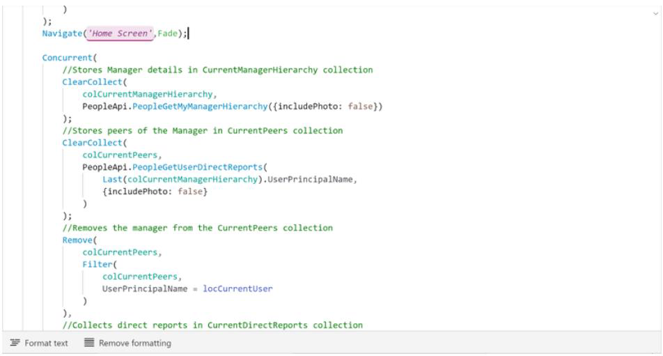
To fire these calls, you can put them in the OnVisible property. Alternatively, if that approach
becomes too messy, you can put the calls in a timer control, and set the variable referenced in the
timer’s Start property either in the OnVisible property or in the OnSelectnullproperty of a hidden
control. You can also combine timers with other controls to show a loading message while the code in
the OnVisible property run. This approach is a great way to let your users know that the app is doing
something. For more information, see the Finding the best place for your code section earlier in this
white paper.
Note: To make code easier to maintain, you might prefer to use the OnVisible property. However, if
you use OnVisible, you won’t be able to use the Navigate function.
To see the Concurrent function in action, see Todd Baginski’s video, HOW TO: Use the Concurrent
Function To Make Your PowerApps Perform Better.
Delegable calls vs. non-delegable calls
When you call your data sources, be aware that some functions are delegable, but others aren’t. Delegable functions can be evaluated on the server and will be more performant. Non-delegable functions require that data be downloaded to the client and evaluated locally. This process is slower and more data-intensive than a delegable call. For more information, see the Understand Delegation in a Canvas App article.
Using local collections
For smaller datasets, especially when frequent access is an issue, consider loading the datasets into local collections first. You can then perform your functions on, or bind controls to, those collections. This approach will be especially beneficial if you make frequent non-delegable calls. Just be aware that there will be an initial effect on performance because the data must be retrieved and there are limits on the number of records that are returned. For more information, see Mehdi Slaoui Andaloussi’s great blog post, Performance considerations with PowerApps.
SQL optimization
Your organization might be using Azure SQL Database for your data back end, to take advantage of its
rich administration capabilities and interoperability. However, a poorly implemented design won’t
handle concurrency, and you might have to increase the database transaction unit (DTU) size and,
therefore, the cost.
For example, Microsoft IT built the Thrive Conference app for an internal conference that had 1,700
attendees. The back end was a 100-DTU SQL Database instance. During performance testing, Microsoft
asked 120 employees in its operations center to open the app simultaneously. The app stopped
responding. Network traces showed that HTTP 500 errors were thrown from the PowerApps
connection object. The SQL logs indicated that the server was fully utilized, and that calls were timing
out.
Because there was no time to rewrite the app before the conference, Microsoft IT increased the scale to
4,000 DTU to meet the concurrency requirements. Therefore, the cost was significantly higher than the
100-DTU server that was originally budgeted. Since then, Microsoft IT has optimized the design by using
the approach that’s described here. Now, a 100-DTU server is more than enough to handle the load, and
the SQL calls are substantially faster.
Delegable functions for SQL
After you’ve read the previous section for an overview of delegation, see the list of data sources and
supported delegation to understand which top-level functions and which predicates of the Filter and
Lookup functions are supported. This information will make a big difference in the performance of your
PowerApps apps, especially on mobile devices, because the whole dataset doesn’t have to be
downloaded and evaluated on the client.
22
Using views instead of tables
Instead of traversing from table to table to get your data, expose views where the joins have been made for you. Provided that you’ve correctly indexed your tables, this approach should be very fast, and it will be even faster if you limit the results by using a delegable function that runs on the server.
Using stored procedures through a flow for performance
The biggest performance improvement that you can make for a PowerApps app that uses Microsoft
SQL Server is to call stored procedures from an implementation of Microsoft Flow (that is, a flow). This approach has the added benefit of decoupling your database design from the PowerApps app. Therefore, you can change the underlying table structure without affecting your app. As we’ll explain later, this approach is also more secure. To use this approach in a PowerApps app that already uses the SQL Server connector, you must first completely remove the SQL Server connector from the app. Then create a new SQL Server connector that uses a SQL sign-in that’s restricted to EXECUTE permissions on stored procedures in the database. Finally, in the flow, call the stored procedure, and pass in the parameters from the PowerApps app. For a detailed explanation of how to create the flow and return its results to PowerApps, see Brian Dang’s article, Return an array from a SQL Stored Procedure to PowerApps (Split Method). This approach has these performance benefits:
- The stored procedure will be optimized through a query execution plan. Therefore, data will be returned faster.
- Delegable calls become less of an issue, because your stored procedure will be optimized to read or write only pertinent data.
- Your optimized flow is now a reusable component. Therefore, it’s available to other makers in the environment for common read and write scenarios.
Expensive calls
Some of your data or API calls will be expensive or time-consuming. Long execution times will affect your perceived performance. Here are some tips:
- Don’t make expensive calls before the next page is opened. Try to make the loading of the next
page instantaneous. Then, on the next page, in the background, make the calls in the
OnVisiblenullproperty. - Use a loading message box or spinner to let the user know that progress is being made behind the scenes.
- The
Concurrentnullfunction is a great way to make your calls to run in parallel. However, when this approach is used, long-running calls can block subsequent code from running.
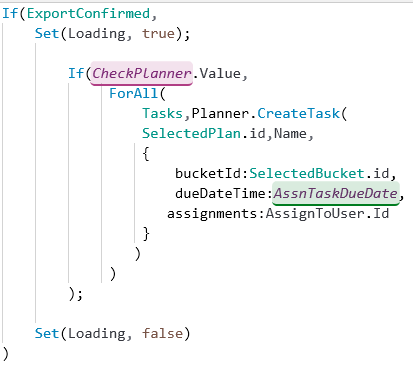
Here’s a bad example in an OnSelect property that goes to the next page.

Here’s a better example. First, here’s the code in the OnSelect property.

And here’s the code in the OnVisible property in the next page.
Limiting the package size
Although PowerApps does a lot to optimize app loading, you can take steps to reduce the footprint of your apps. A reduced footprint will be especially important for users of older devices, or users in locales where there’s higher latency or reduced bandwidth.
- Evaluate the media that are embedded in your app. If something isn’t used, delete it.
- Embedded images might be too big. Instead of PNG files, see whether you can use SVG images. However, be careful about using text in SVG images, because the font that’s used will have to be installed on the client. A great workaround when you need to show text is to superimpose a text label over an image.
- Evaluate whether the resolution is appropriate for the form factor. The resolution for a mobile app doesn’t need to be as high as the resolution for a desktop app. Experiment to get the right balance of image quality and size.
- If you have unused screens, delete them. Be careful not to delete any hidden screens that only app makers or administrators use.
- Evaluate whether you’re trying to fit too many workflows into one app. For example, do you have both admin screens and client screens in the same app? If so, consider breaking them into individual apps. This approach will also make it easier for multiple people to work on the apps at the same time, and it will limit the “blast radius” (amount of testing) when app changes require a full test pass.
Periodically republishing your apps
The PowerApps product team is continually optimizing the Power platform. Sometimes, for backwards compatibility, these optimizations will apply only to apps that are published by using a certain version or later. Therefore, we recommend that you periodically republish your apps to take advantage of these optimizations.
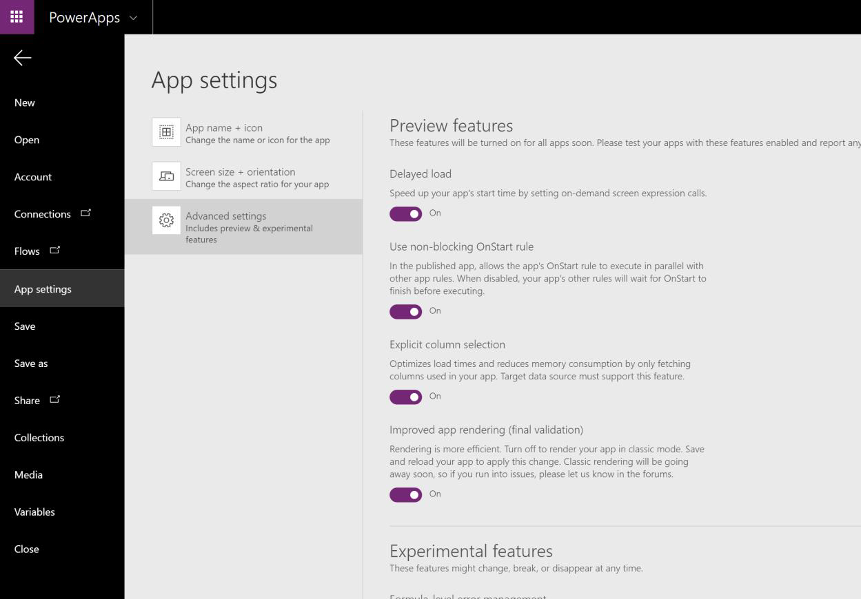
Advanced settings
The PowerApps product group offers preview features that makers can optionally turn on for their applications. Some of these features can give your apps a significant performance boost. For example, the Delayed load feature turns on lazy loading for your application. Then, during the initial load, the runtime will load only the screens and code that are required to show the first screen.
Use these features at your own risk, and be sure to test your apps thoroughly when you experiment with
these features.
App design
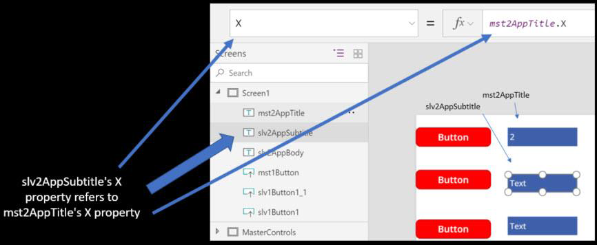
Using parent/child relationships for relative styling
We recommend that you use one control’s style as the basis for styling other controls. In general, use relative styling for the color, fill, x, y, width, and height properties.
Galleries
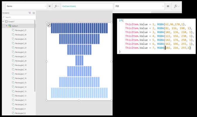
Use galleries for almost everything that’s repetitive and linear. The “brute force” (manual placement of multiple controls) method might be faster initially, but it will be very time-consuming to modify later. If you must present a series of information or controls that seem repetitive, always consider whether you might be able to create a internal collection by using a gallery.
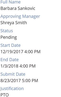
It’s also useful to use a Gallery control as a view form, instead of using a Display Form control.
For example, you have a three-screen “app from data” app. There’s a Users data source that contains
the user’s name, job title, and phone number.
The first screen, the User List screen, has a control that’s named galUsers. This control lists all users.
The second screen, the User Details screen, just has a gallery control that’s named galUserDetails.
The Items property of this control is set as shown here.
Table(
     {Title: "User Name", Value: galUsers.Selected.DisplayName},
     {Title: "Job Title", Value: galUsers.Selected.JobTitle},
     {Title: "Phone Number", Value: galUsers.Selected.PhoneNumber}
)
This method is much faster than trying to modify three separate data cards in a display form.
Forms
Use forms for repetitive data entry fields. Forms also let you quickly group several fields instead of having to use several text boxes. A form is much easier to work with than individual text boxes, because forms let you to take advantage of parent/child relationships to implement relative styling.
Common Data Service for Apps
We recommend that you use a single screen to handle edit/insert operations.
If possible, use a CardGallery control to handle updates to data, instead of referencing individual
controls in a Patch function.
When you name context variables, you should indicate which record they’re associated with.
Multiple form factors
When you make the same PowerApps app target both phone and tablet layouts, first create one version of the app, run it through testing, and finalize it. Then convert it to the other version before you modify the layout and screens. This approach helps guarantee that your expressions, controls, variables, data sources, and so on, all have the same names. Therefore, it’s much easier to support the apps and develop them. To learn how to convert one form factor to another, see the How to convert a PowerApp from one layout to another article on Todd Baginski’s blog.
Configuration values
You likely use SaveData and LoadData to store user-defined settings in your mobile apps. They
provide a handy way of caching data.
Note: SaveData and LoadData work only inside the PowerApps player client app. Keep this limitation
in mind as you design your apps, because these functions won’t work when PowerApps apps are loaded
in web browsers.
Your app will probably need to have application settings that can be easily changed in one place, such as
color schemes, URLs to other apps, or settings that define whether debugging controls are visible on app
screens. Therefore, the people who deploy your application can quickly set those values, and there’s less
risk that the code will be messed up during deployments. Think of these settings like an ASP.NET
web.config file.
Here are several approaches to storing configuration values, in order of increasing difficulty.
Creating a hidden configuration screen
A surprisingly easy way of setting configuration values is just to create a hidden screen and put your configuration values in text input controls. In this way, you can change application settings without editing code. To use this approach, follow these steps:
- Make sure that the configuration screen isn’t the first screen in the application. Put it anywhere else in your screen order. We recommend that you make it the last screen, so that it’s easily found.
- Make sure that your users can’t go to the screen.
- Give yourself a way of going to the screen. The easiest way is to make the screen accessible only
when the app is edited, and then manually go to the screen. On the home screen of the app, you
might even have a hidden button that’s only visible to app makers and admins, and that lets
them go to the configuration screen. You can verify that users are app makers or admins by
checking their email address (for example, check
User().Email) or their AAD group membership, or use the PowerApps for Makers connector.
The following example is from the Microsoft PowerApps Company Pulse sample template. Here, you can see text input controls that let the PowerApps admin configure application setting values.
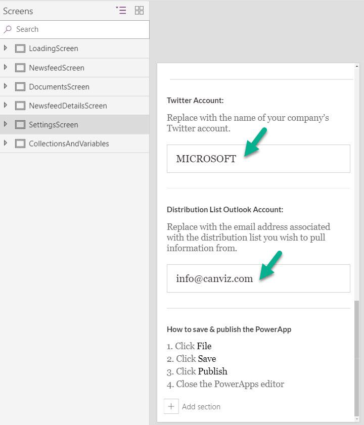
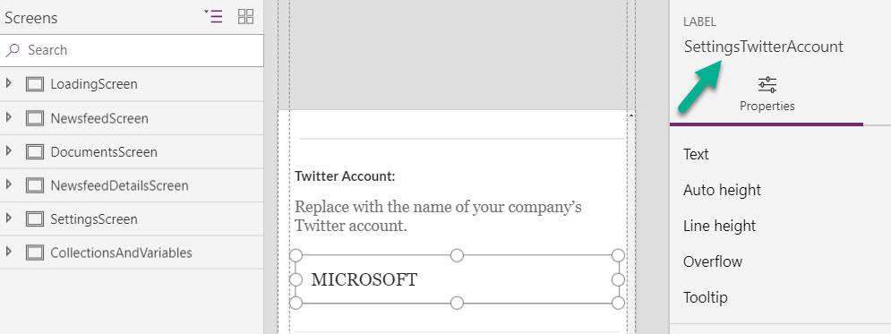
Here, you can see the name of the control that stores the Twitter account settings value.
Here, you can see where the value is used to return tweets for the Twitter account from the Twitter connector.

Although this approach is the easiest way of changing values, it does have some downsides:
- You must republish the app to change values and make them persist.
- Because values persist in the app, you must create a process that updates these values before you export the app in preparation for a move to another environment.
Storing configuration values in Common Data Service for Apps
Alternatively, you can create a new Common Data Service for Apps entity and store configuration values there. Because the values persist outside the app, they can be modified at any time without redeploying the app. Common Data Service for Apps entities can have unique values per environment. For example, URLs can be different in pre-production and production environments. Although this approach is a great way of maintaining configuration values, it also has downsides:
- Unlike the text input control approach, this approach requires a call-back to Common Data Service for Apps. Therefore, there will be a slight effect on performance, and if Common Data Service for Apps is unavailable (for example, if the user is on a mobile device and loses his or her connection), the app might not be shown correctly.
- Because there’s no caching, a new call will be made every time the app is opened.
- There’s no monitoring if the call fails. You’ll have to rely on your users to inform you of app failures.
Using a custom API
Although implementation approach is the most difficult, Microsoft IT has had success with an Azure app service that stores configuration values as name/value pairs in Azure Table storage. An OAuth secured custom connector fetches the configuration values, and output caching (which includes cache invalidation as values change) enhances performance. Azure Application Insights with alerts sends notifications when there’s an issue and makes it much easier to troubleshoot a user session.
Error handling/debugging
Toggle controls for error handling
In the OnTimerStart property section, we demonstrated one pattern that you can use to handle errors with Timer controls. Another pattern that you can use to handle errors involves a Toggle control. 30
The following illustration shows this approach.
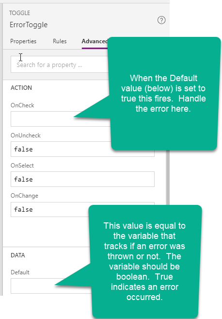
In this approach, logic for validation and/or error handling can be encapsulated inside a single control.
The Toggle control can evaluate complex conditions and issue a true or false value. Other controls
can then reference that value to show/hide error messages, change font or border colors, make buttons
unavailable, log to Application Insights, and much more. If you make this control visible and editable, the
app maker can switch the error condition on and off to watch the user interface (UI) react. This
approach can save time and effort when you develop or debug the app.
Using a canvas control as a debug panel
As you’re developing your app and testing it, you can use a canvas control to create a semi-transparent debugging panel that appears over the top of your screens. This panel can then have editable fields, toggles, or other controls, as needed, so that you can change your variables while the app is in play mode. For a step-by-step instructional video, see PowerApps - Best Practices: Debug Panel by Brian Dang.
Showing debug controls to app makers
You don’t want to show your debug controls to all your users. Therefore, you must either manually
toggle the Visible property of your debug control (in PowerApps Studio) or automatically toggle
control visibility for certain users.
One elegant approach is to add the PowerApps for Makers connector. Despite the name, this connector
can be used by non-makers for read-only calls. Then call the GetAppRoleAssignments function to
determine whether the signed-in user is a maker for the current app.

For this example, you’ll then set the Visible property of your debug controls to gloIsMaker, so that
those controls appear only to app users who have maker permissions.
The benefit of this approach is that you won’t need to use a configuration table to specify special debug
permissions.
You can also show and hide debug controls for just app makers or admins by checking their email
address (for example, check User().Email) or their AAD group membership.
Documentation
Code comments
As of June 2018, you can add comments to your code. As you write code in your application, be sure to heavily comment it. Comments will help you when you return to your application months later, and the next developer who works on the app will thank you for them. There are two kinds of comments:
- Line comments: If a double forward slash (
//) is added to any line of code, PowerApps will treat the rest of the line (including the//) as a comment. Use line comments to explain what happens next. You can also use them to temporarily disable a line of code without deleting it (therefore, they’re useful for testing). - Block comments: Any text that’s wrapped inside
/*and*/will be treated as a comment. Whereas line comments comment out only a single line, block comments can comment out multiple lines. Therefore, they’re useful for multiline comments (such as a code module header). You can also use them to temporarily disable multiple lines of code while you’re testing or debugging. 32
We recommend that you add comments after you use the Format text feature, especially if your comments precede a code block. The Format text feature uses the following logic for existing comments:
- If a property begins with a block comment, the next line of code will be appended to it.
- If a property begins with a line comment, the next line of code won’t be appended to it. Otherwise, the code will be commented out.
- Line and block comments everywhere else in the property will be appended to the previous line of code.
Don’t worry about adding too many comments or comments that are too long. All comments will be stripped out when PowerApps creates the client app package. Therefore, they won’t affect the package size or slow down the app download or loading times.
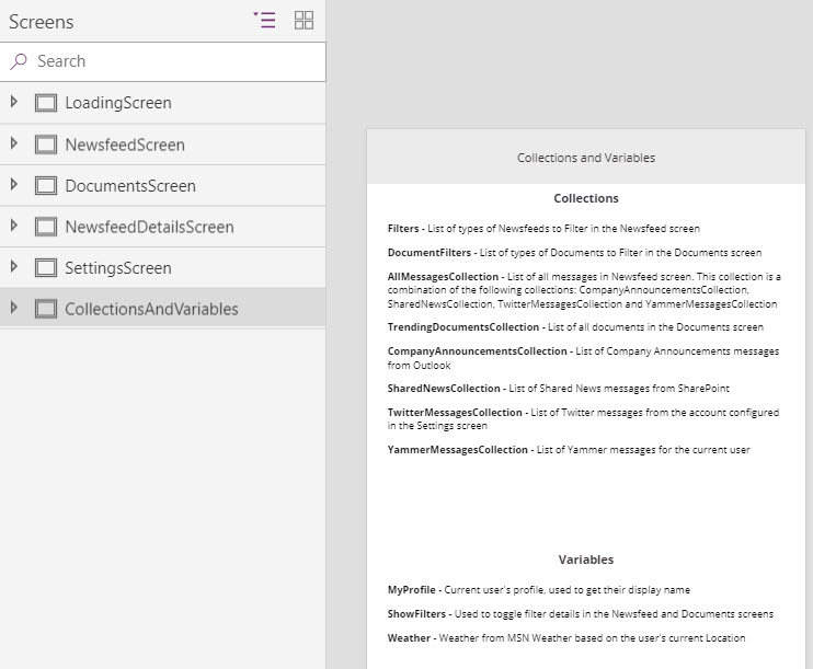
Documentation screens
We recommend that you create screens to document the collections and variables that are used in the PowerApps app. Don’t link to these screens from the other screens in your app. These screens are seen only when the app is open in edit mode. Here’s an example from the Microsoft PowerApps Company Pulse sample template.
